
Charting Presentation Manager
User-Created Visualizations with LiveBook
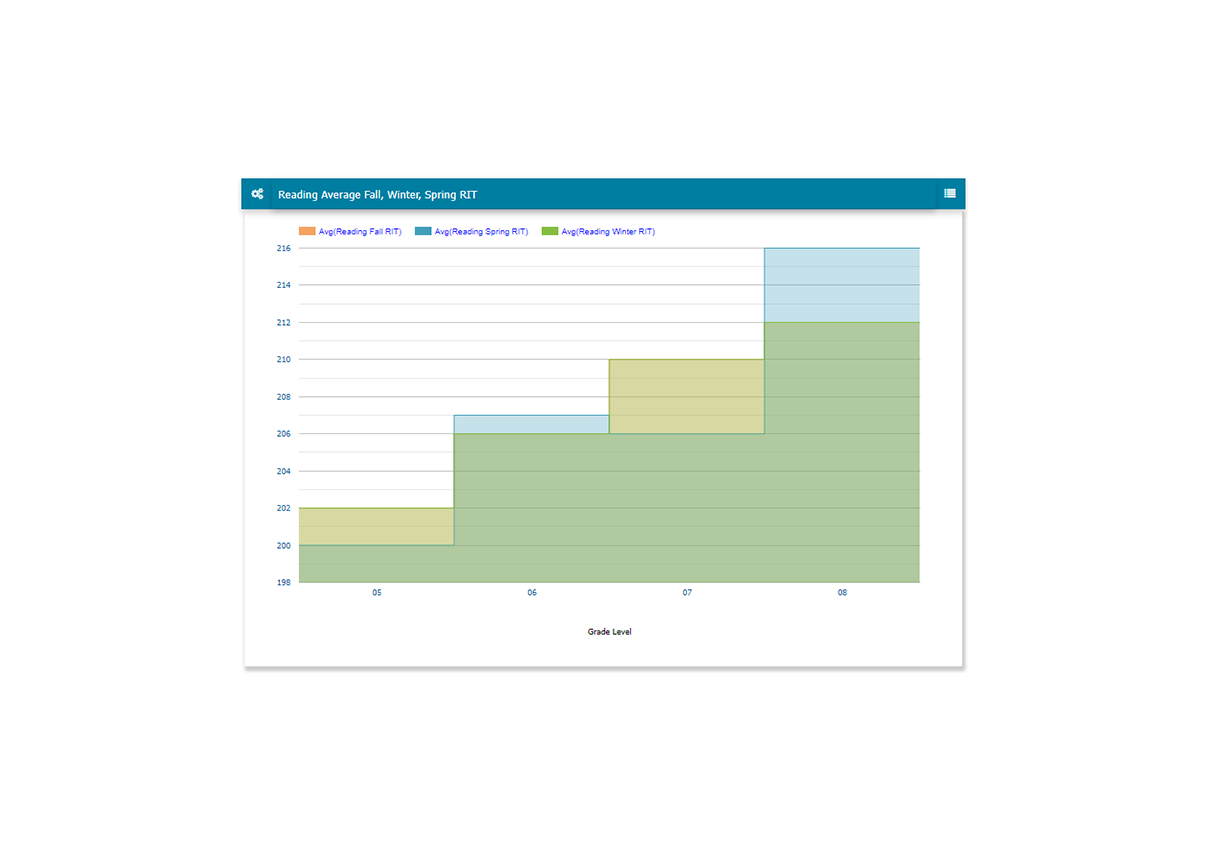
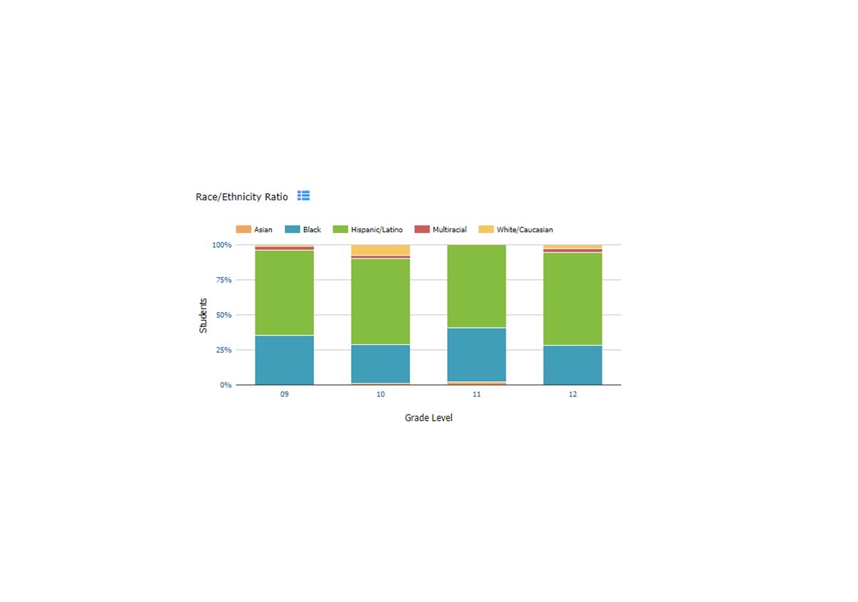
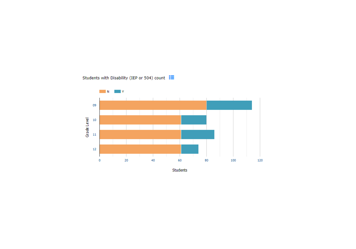
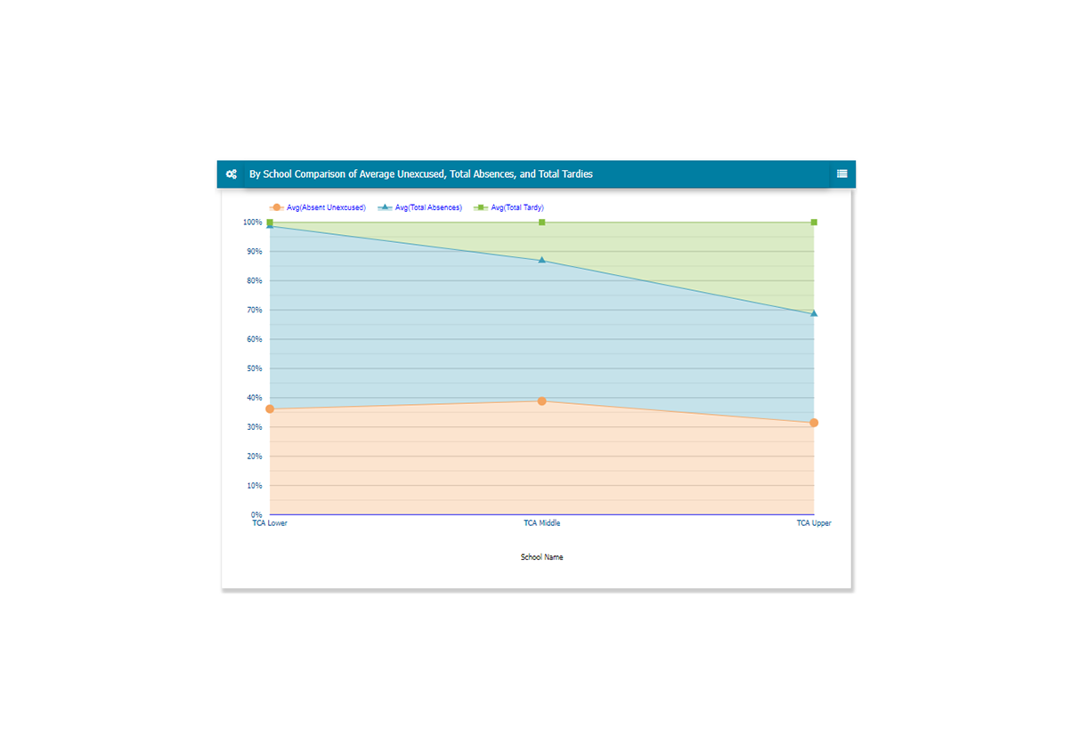
Present your school’s data metrics with the built-in LiveBook Charting Presentation feature. The Charting features empowers the user to create their own presentations tailored to suit their needs and their audience. Choose from a plethora of chart types including, Histogram, Pie, Combo, Bubble, Tree Map, Box-Whisker, DataGrid, and Radar. Chart options enable the user to set labels, define a benchmark or constrain the data to a certain range to support the narrative. The user can customize the layout and include a Header and Sidebar with details to make a complete and professional presentation that can be shared with other LiveBook users or played like a slide show for board, department, or parent meetings.


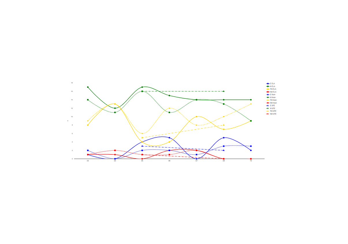
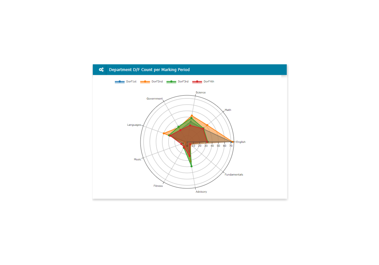
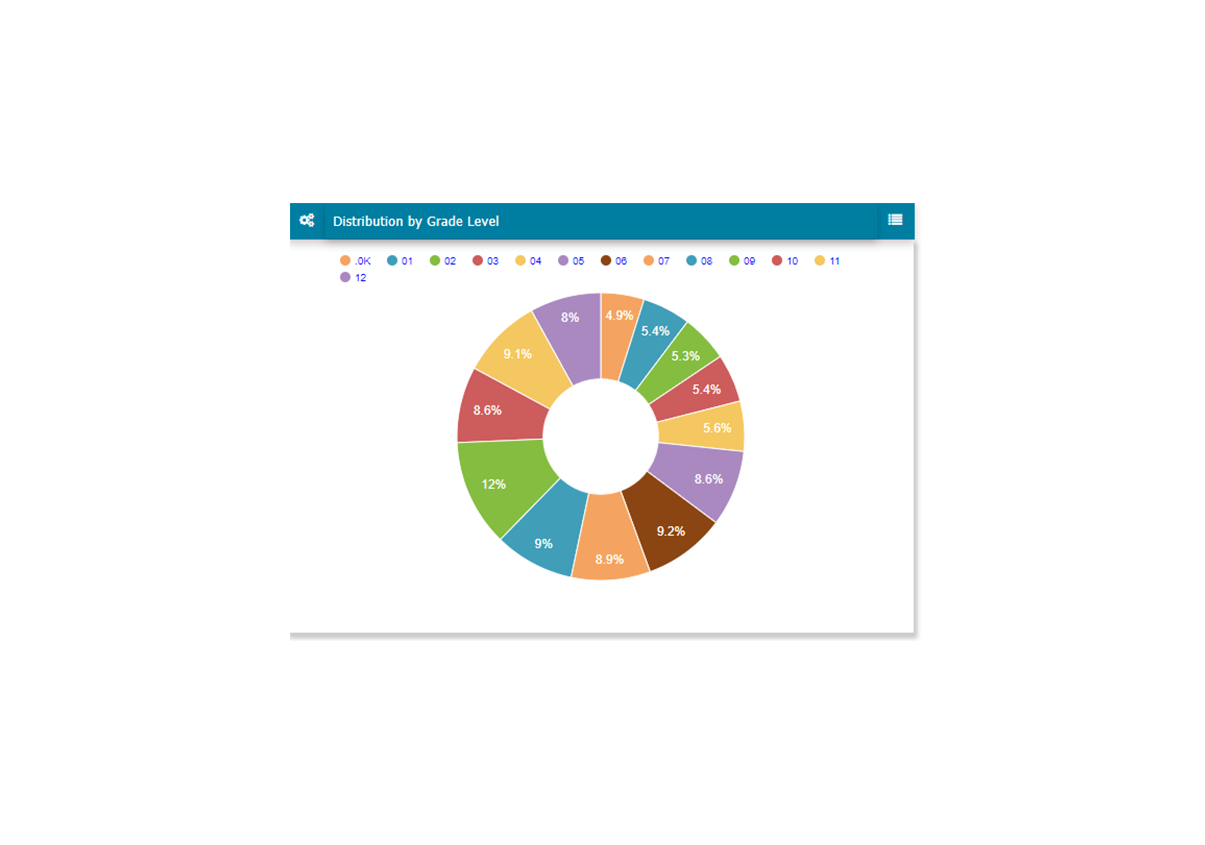
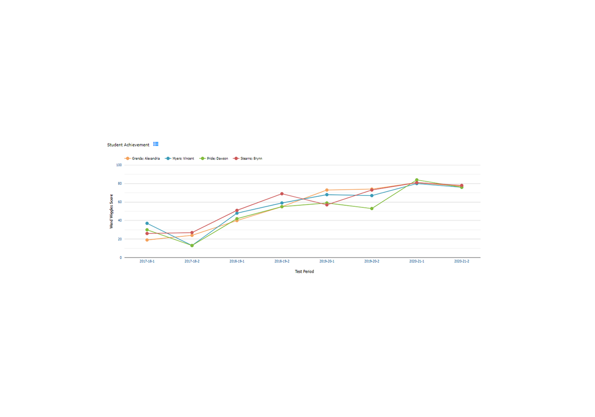
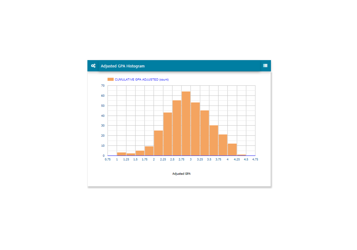
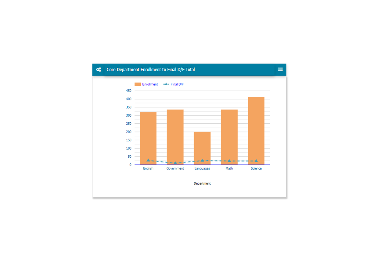
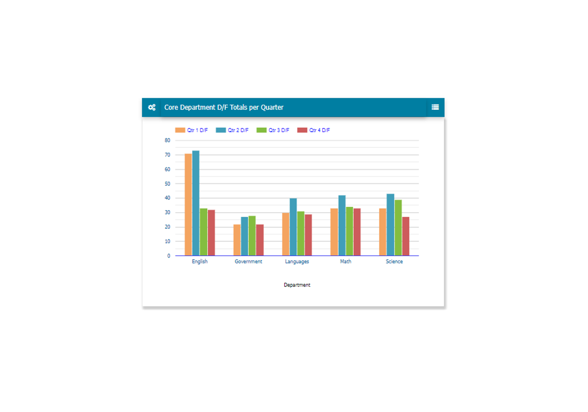
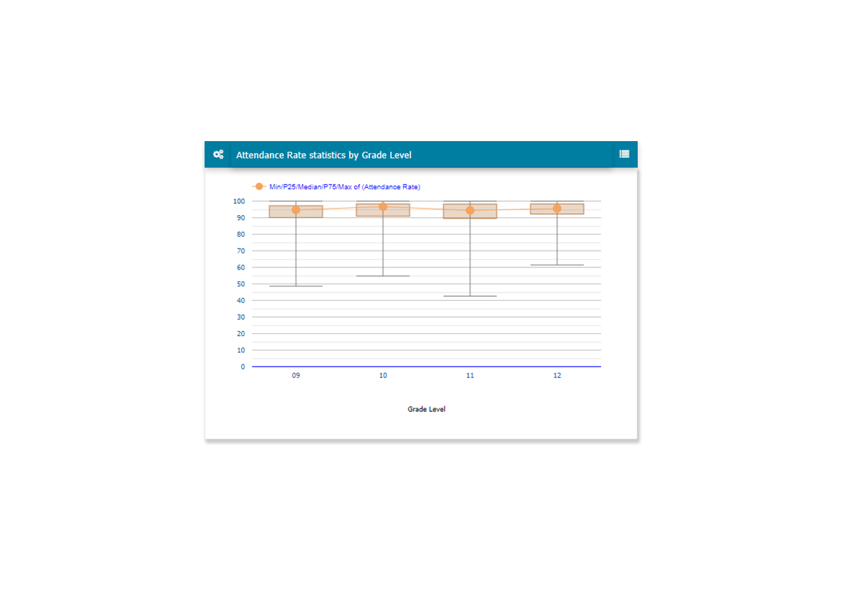
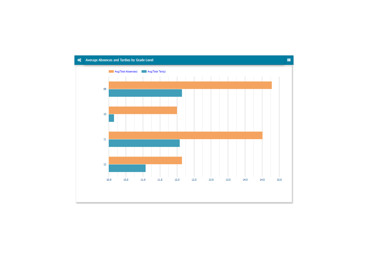
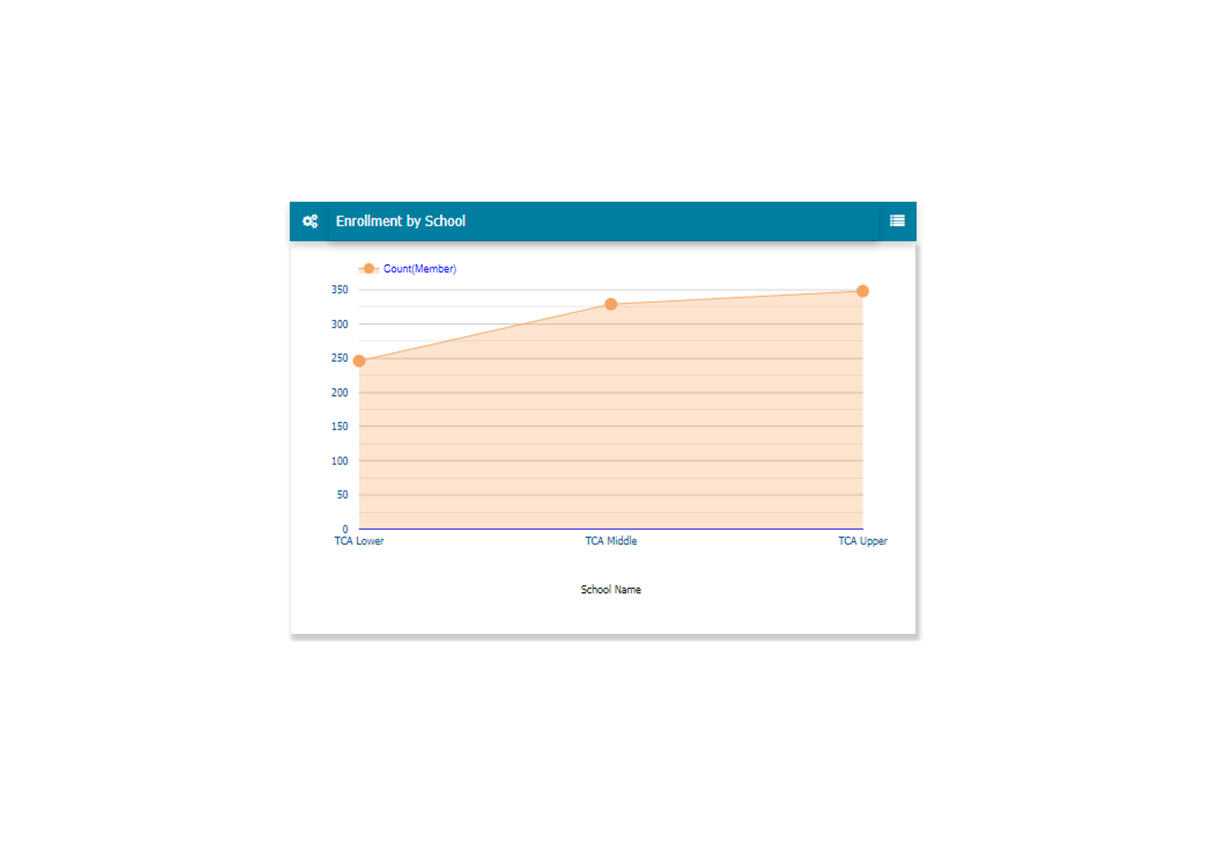
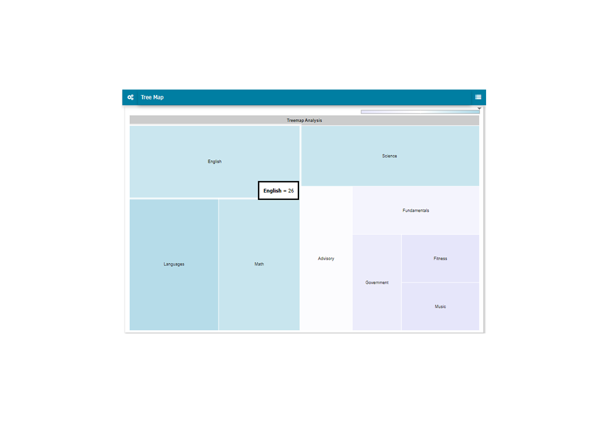
Over 25 Chart Types!
• Histogram
• Combo
• Tree Map
• DataGrid
• Scatter
• Pie
• Bubble
• Box-Whisker
• Radar
• And More...
Set-Up and Customize Your Charting Presentations
With the Charting Presentation Manager it's easy to create and customize your presentations. Build one or many charts, include details in the sidebar, save and manage multiple presentations, all within the LiveBook platform.


Create and Present Any Number of Charts
Make the most impact with your audience by included a variety of visuals. Choose from over 25 types of charts to show in your presentations, including, Bar, Tree Map, Stepped Area, Column 100, Stacked Bar, Spline, Radar, Pie, Histogram, Column, Box-Whisker, and more.
Default title
Default description
Rediker Software, Inc., 2 Wilbraham Road, Hampden, MA 01036
© 2023 Rediker Software, All Rights Reserved | Terms & Privacy Policy